Digital Freestyle // selection

Work

Projects that are in use, with numbers where numbers exist. The focus of recent years has been cetrac GmbH, before that around 100 clients from retail, industry, healthcare and agriculture.

Head of Marketing // since 12/2025

cetrac 2026

Website // EasyFlow // 7 languages

Scaffolding & formwork dealer

250,000parts
24,000 m²warehouse
3,500customers
42countries

Head of Marketing, IT coordination and development at cetrac GmbH in Leipzig, a specialist dealer for new and used scaffolding and formwork: 250,000 parts, 24,000 m² of warehouse space, 3,500 customers in 42 countries. A one person digital department that owns strategy, delivery and quality assurance and orchestrates AI agents as a tool.

  • Website relaunch of cetrac.com: TYPO3 12, new information architecture, category and product structure, Solr shop. Redesign with Philipp Schade and Stephan Gonder.
  • 7 language versions run single handed, delivered with AI support in the TYPO3 backend. German, English, French, Italian and Spanish all complete and live.
  • Market adaptation instead of literal translation, Sistrix keyword research per target country, hreflang consistency.
  • EasyFlow: an own product line of 5 free calculators plus a scaffolding manager, 7 languages including RTL, on an own Hetzner server with Docker and Caddy.
  • Press publication of the tools in the bauhandwerk newsletter, Bauverlag, confirmed for August 2026.
  • Catalogue 2026 for the launch of own product lines: generator pipeline in Python and WeasyPrint, 68 parts, 324 vector graphics, print ready CMYK PDF.
www.cetrac.com
Transformation

What came out of it at cetrac

The visible side is the website. The work behind it concerns the warehouse, the ERP system and daily operations: a self-built stocktaking app that turns any company phone into a scanner, zoning of the entire warehouse, and live stock that goes to the website every morning.

All transformation projects in detail

Clients and campaigns

Five projects in detail

OUTLETNR.1 logo, wordmark on black
Wordmark from the reworked corporate design
OUTLETNR.1 // investor pitch

From a follower plateau to a funded concept

The client, a career changer, had started his Instagram presence by copying other creators and hit a plateau at 12,000 followers: reach yes, effect no. The problem was not the posting rhythm but the fact that the brand had nothing of its own to say.

I started with an audience and market analysis, derived a redesign of the corporate identity from it and restructured the website. On that basis came a complete investor pitch: positioning, the numbers, visual language and narrative in one document the client can present himself.

Content metrics picked up, engagement rate and reel views noticeably. What mattered most was the pitch: to date it has brought in 120,000 euros of investment.

+3 %engagement rate
+80 %reel views
120.000 €investment raised
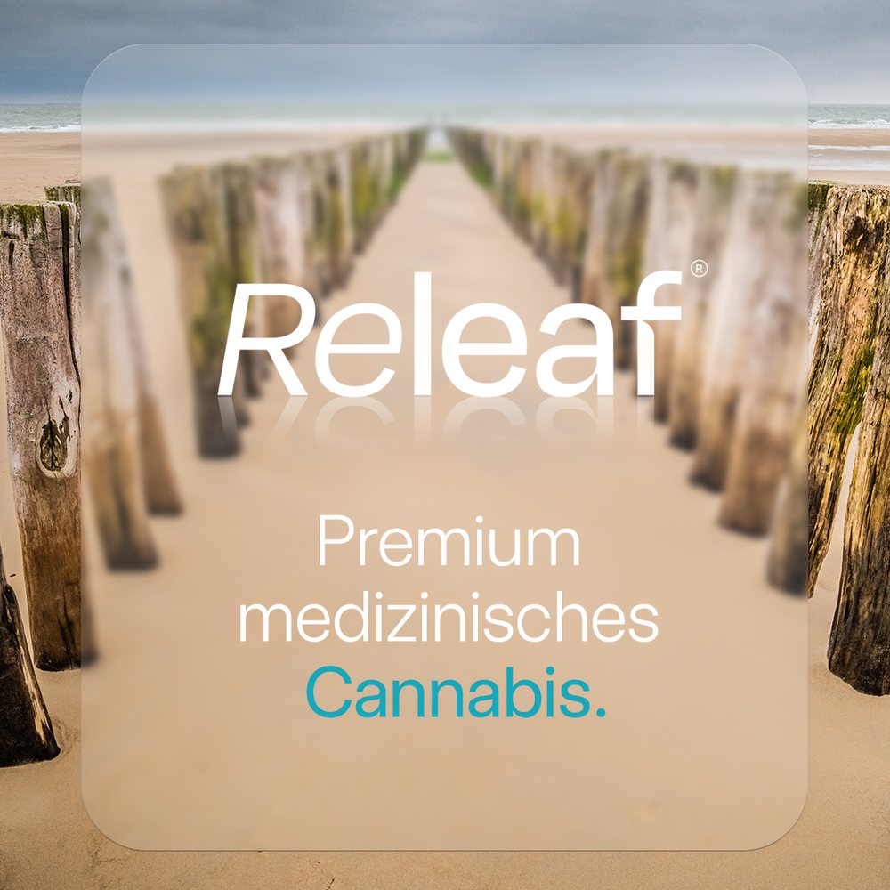
RELEAF launch campaign visual: premium medical cannabis
Campaign visual from the launch series
RELEAF // creative strategy

German launch of a regulated brand

As creative strategist I supported the German launch of RELEAF, a brand for medical cannabis. A field where advertising is tightly regulated and any exaggeration becomes a problem: the communication has to build trust without promising cures.

The result was a growth strategy, a launch campaign and a social media series from teaser to brand message. The visual language is deliberately calm and clinically clean so the brand is taken seriously in a medical context instead of ending up in the lifestyle corner.

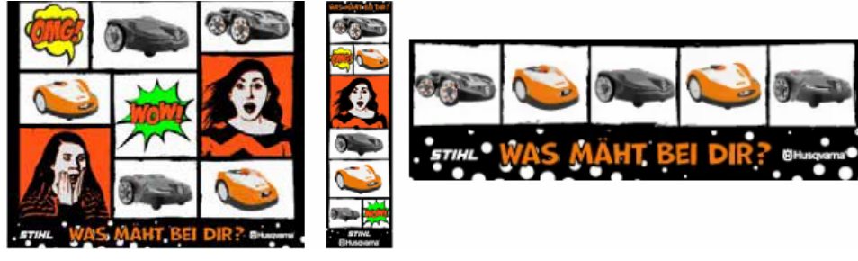
Deppe und Stücke social media campaign in comic style featuring STIHL and Husqvarna
Campaign visuals from the series after the merger
Deppe und Stücke // campaigning

One brand out of two competitors

The merger of Deppe and Stücke, the two leading agricultural businesses in central Germany, was a consulting challenge on every level: two established customer bases, two self-images, one shared future.

Together with NewFaceMedia I developed the brand strategy for the merged company and ran the first online campaigns after the merger. The comic style was a deliberate move away from the catalogue aesthetics of the industry: lawnmowers and robotic mowers staged as products worth talking about.

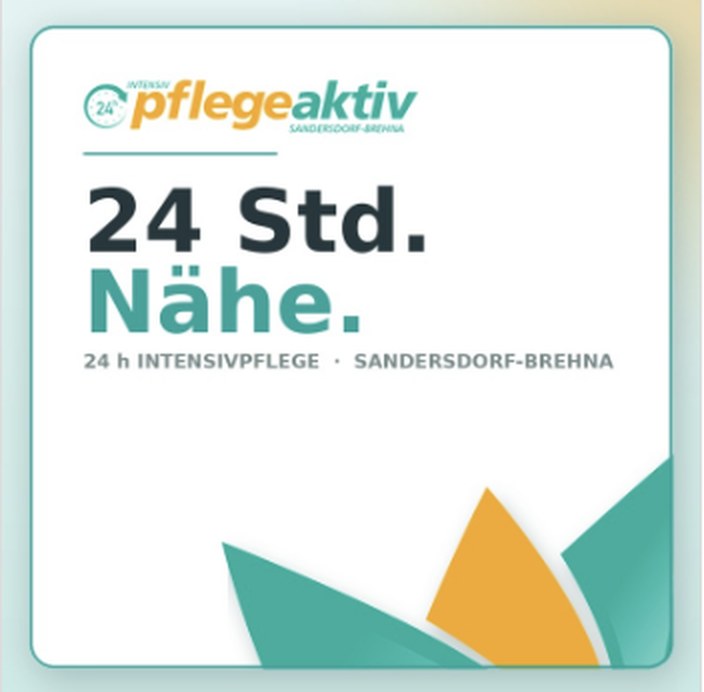
Pflegeaktiv campaign visual, 24-hour intensive care in Sandersdorf-Brehna
Campaign visual in the new identity
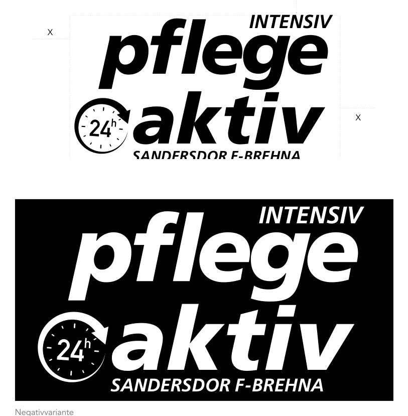
Pflegeaktiv logo in positive and negative from the CD manual
Pflegeaktiv // corporate design

Trust you can see

Care services do not compete on price, they compete on trust. That is exactly what the old identity failed to convey: inconsistent, dated, barely usable on a phone, even though relatives search almost exclusively on mobile.

The design relaunch brings the identity to a clear, contemporary state and holds it together: logo in positive and negative, fixed colour and type rules, a CD manual external partners can follow too. Mobile presentation became the main concern rather than an afterthought.

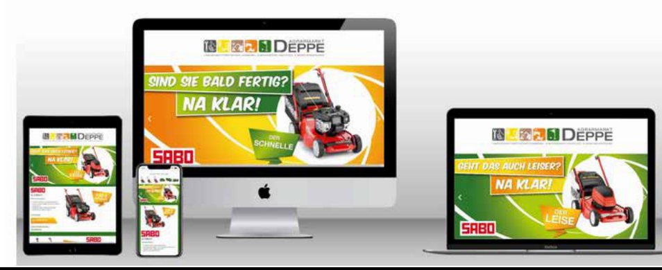
Responsive web design on iMac, MacBook, tablet and smartphone
Responsive implementation across all screen sizes
Around 100 projects // screen and visual design

Websites that do more than look good

After around 100 websites, landing pages and relaunches, UX and UI design matter to me as much as functionality. A layout succeeds when it lifts engagement and conversion rates, generates leads and carries the customer journey, not when it looks good in a portfolio.

HTML, WordPress, TYPO3, ERP systems and the common e-commerce and CRM platforms are familiar ground. That way I do not design anything nobody can build or maintain afterwards: the design is created with the editorial team and the data source in mind.

Agency years

Clients from the alt/cramer period

From 2012 to 2020 I worked as a freelance visual designer via alt/cramer change factory: concept, creative work and the design of the relaunch concepts themselves, plus visual, screen and motion design. The collaboration is confirmed by a reference letter from the agency, which I provide on request.

Daimler AG Dänisches Bettenlager Deutsches Institut für Normung e.V. Heckler & Koch Burda KARSTADT Merlin Entertainment

The cases in detail: Coming Home and the brand alignment in retail

Design-Junky // part-time

Tattoo Art goes A.I.

I am a passionate AI tester and have had enough of the same designs, dull lettering and tattoos copied a hundred times over. That is why I do not work as a full-time tattoo artist but part-time with a regular clientele. Out of that came the idea of developing AI-generated tattoo flashes: original motifs instead of templates that have already been inked a hundred times.

Open to projects, collaboration and professional exchange. Write to me about what you have in mind and we will find out whether it fits.

Write to me